Rebranding Part Two: Visual Identity
We describe our business as "A boutique creativity lab focused on print projects. Primarily dedicated to indie publications that help preserve our cultural heritage and the good-old craftsmanship that exists outside of our screens." We also acknowledge our responsibility towards natural resources and aim to be conscious of our relationship with nature.
Before we dive into Hamaka's visual identity, let's start by briefly talking about logos. After all, first impressions matter! A good logo will create intrigue, curiosity, and eventually, loyalty!
A logo is a graphic symbol used to identify a company, organization or brand. Keyword: Identify. At a deeper level, it will help customers understand what you do, who you are and what you care about. A logo will also allow you to stand out and create emotional connections over time. Logos are formed by typography, geometric elements and colours combined to share a message.

Logos are roughly categorized into five categories:
Lettermarks and Wordmarks
Also called logotypes. They are font-based logos that focus on single letters or words. Lettermarks include initials, like IBM, Nasa, HBO, Netflix, and they're used to simplified longer company names. Wordmarks include full names and are the best option for new businesses to get their brand out there. Some iconic examples are The New York Times, Tour de France, RayBan, Garmin, Sony.
Pictorial marks
They are an icon or graphics-based logo. It takes more time to be recognizable as the brand gets established. They could be inspired by the literal name, like Apple or Penguin. By what your company does, like Snapchat's ghost. Or try to evoke emotion, like WWF's panda. We can also include mascots in this category. Which are illustrated cartoonish characters that represent a brand's personality, like Pringles or Wendys.
Emblem
It could also be considered a pictorial mark, but we decided to keep it separate due to their complexity. An emblem logo consists of typography within a complex symbol, like badges, seals and crests. Some examples are Harley Davidson, NFL or Starbucks, and most schools and government organizations.
Abstract marks
An abstract geometric form representing your business that doesn't have apparent meaning. It requires a deep understanding of colour theories, shapes and structure. Some examples are Nike, AirBnB, Pepsi.
Combination mark
One of the most common options when trying to make a new brand recognizable. It incorporates typography and graphic elements simultaneously, like Lacoste or Adidas.

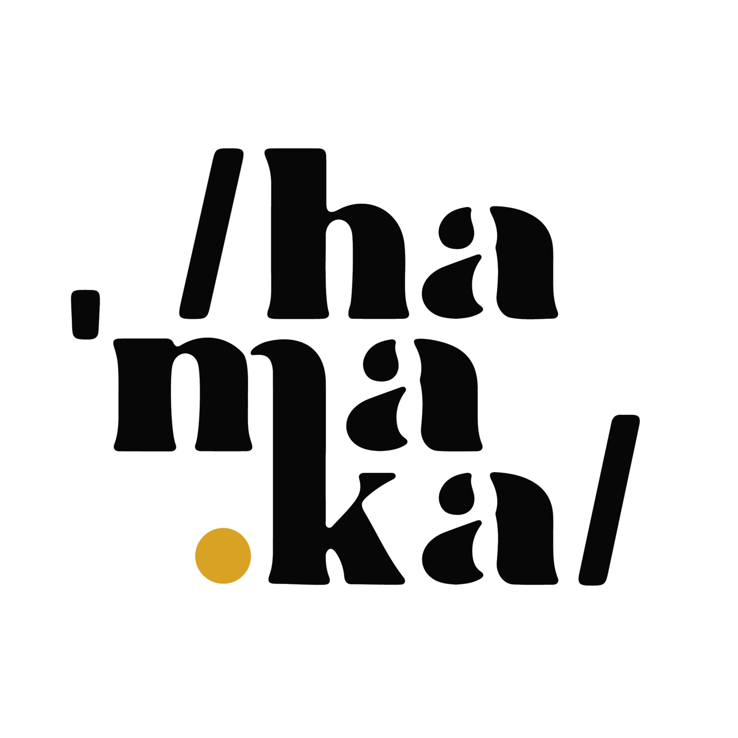
It is easy to get caught up in the visual aspect of hammocks. After all, they look like suspended smiles with clouds or treetops for eyes. But we decided to avoid the pictorial style and focus on the word itself to create a wordmark. We all know how hammocks look like, but it was important for us to focus on the Caribbean name to reinforce its origins. Some successful examples of wordmarks are Nikon, Mini, BMW, The North Face, FedEx, Intel, Lego, Visa, Nasa, Virgin and countless more.
Equally difficult as choosing a business name is choosing the typography to represent your business. We were looking for something uniquely ours, so after finding the style that fit our needs, we transformed and designed our own letters.
We chose a serif font to play homage to stylistic font families. After finding our style, we jumped on Illustrator and started making adjustments and modifications. We settled for a disconnected manner to show the passing of time. The weaker links or smaller details in our journey might fade away, but the important lessons and life experiences will remain as part of the bigger picture.

Once we got the right typography, we started playing around with the distribution of elements. Treating each letter as an individual graphics element and striving to provide "clues" by adding the pronunciation guides.
What started as a traditional, horizontal word evolved into a stamp-like shape. After all, we want to leave our "mark" with this project. The round version, encapsulated in a not perfectly round circle, reflects our imperfections as humans. Since most of our focus will be on people's personal stories, we decided to add a human touch by making the circle freehanded. It also provides movement and adds life to it.

Next in line was the decision to blend the "m" with the "k" like a free-flowing waterfall that connects two levels of terrain, as we aim to reconnect humans with nature. The yellow dot brings hope like the light at the end of a tunnel. As we move through our life journeys, we will encounter many challenges. What matters is to stay strong and keep moving towards brighter roads.
The brackets at the beginning and end are commonly used in pronunciation guides. In our case, they represent the beginning and the end of a story, from cover to cover!
